LVGL: Tips and Tricks
Here are a couple recipes for various interesting things you can do with Lvgl in ESPHome.
NOTE
Many of the examples below call service actions in Home Assistant; however, Home Assistant does not allow such action
calls by default. For each ESPHome device which will call actions, you must explicitly enable this setting in Home
Assistant. This may be done when the device is initially adopted or by using the Configure option in the “devices”
list of the ESPHome integration.
NOTE
The examples below assume you’ve set up LVGL correctly with your display and its input device, and you have the
knowledge to set up various components in ESPHome. Some examples use absolute positioning for a screen with dimensions
of 240x320px ; if your display’s dimensions differ, you’ll need to adjust them in order to obtain the expected results.
Local light switch
Section titled “Local light switch”
The easiest way to integrate an LVGL switch widget and a switch or light is with
automations:
light:  - platform: ...    id: local_light    name: 'Local light'    on_state:      - lvgl.widget.update:          id: light_switch          state:            checked: !lambda return id(local_light).current_values.is_on();
lvgl:    ...    pages:      - id: main_page        widgets:          - switch:              align: CENTER              id: light_switch              on_click:                light.toggle: local_light
Remote light button
Section titled “Remote light button”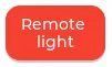
If you’d like to control a remote light which appears as an entity in Home Assistant from a checkable (toggle)
button, first you need to import the light state into ESPHome, and then control it using a
action call:
binary_sensor:  - platform: homeassistant    id: remote_light    entity_id: light.remote_light    publish_initial_state: true    on_state:      then:        lvgl.widget.update:          id: light_btn          state:            checked: !lambda return x;
lvgl:    ...    pages:      - id: room_page        widgets:          - button:              id: light_btn              align: CENTER              width: 100              height: 70              checkable: true              widgets:                - label:                    align: CENTER                    text: 'Remote light'              on_click:                - homeassistant.action:                    action: light.toggle                    data:                      entity_id: light.remote_light
Light brightness slider
Section titled “Light brightness slider”
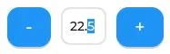
You can use a slider or an arc to control the brightness of a dimmable light.
We can use a sensor to retrieve the current brightness of a light, which is stored in Home Assistant as an attribute
of the entity, as an integer value between 0 (min) and 255 (max). It’s convenient to set the slider’s min_value
and max_value accordingly.
sensor:  - platform: homeassistant    id: light_brightness    entity_id: light.your_dimmer    attribute: brightness    on_value:      - lvgl.slider.update:          id: dimmer_slider          value: !lambda return x;
lvgl:    ...    pages:      - id: room_page        widgets:          - slider:              id: dimmer_slider              x: 20              y: 50              width: 30              height: 220              pad_all: 8              min_value: 0              max_value: 255              on_release:                - homeassistant.action:                    action: light.turn_on                    data:                      entity_id: light.your_dimmer                      brightness: !lambda return int(x);
Note that Home Assistant expects an integer at the brightness parameter of the light.turn_on action call, and since
ESPHome uses floats, x needs to be converted.
This is applicable to action calls like fan.set_percentage or valve.set_valve_position, too; the only difference
is that max_value has to be 100.
Media player volume slider
Section titled “Media player volume slider”
Similarly, you can use a slider or an arc to control the volume level of a media player, which uses float values.
With a sensor we retrieve the current volume level of the media player, which is stored in Home Assistant as an
attribute of the entity, and is a float value between 0 (min) and 1 (max). Since LVGL only handles integers,
it’s convenient to set the slider’s possible values to be between 0 and 100. Thus a conversion is needed back
and forth, meaning that when we read the value from Home Assistant we have to multiply it by 100, and when we set
the volume through the action call, we have to divide it by 100 :
sensor:  - platform: homeassistant    id: media_player_volume    entity_id: media_player.your_room    attribute: volume_level    on_value:      - lvgl.slider.update:          id: slider_media_player          value: !lambda return (x * 100);
lvgl:    ...    pages:      - id: mediaplayer_page        widgets:          - slider:              id: slider_media_player              x: 60              y: 50              width: 30              height: 220              pad_all: 8              min_value: 0              max_value: 100              adv_hittest: true              on_value:                - homeassistant.action:                    action: media_player.volume_set                    data:                      entity_id: media_player.your_room                      volume_level: !lambda return (x / 100);
The adv_hittest option ensures that accidental touches to the screen won’t cause sudden volume changes (more details
in the slider doc).
NOTE
Keep in mind that on_value is triggered continuously by the slider while it’s being dragged. This generally has
a negative effect on performance. For example, you shouldn’t use this trigger to set the target temperature of a heat
pump via Modbus, or set the position of motorized covers, because it will likely cause malfunctions. To mitigate this,
consider using a universal widget trigger like on_release to get the x variable once after the interaction has
completed.
Semicircle gauge
Section titled “Semicircle gauge”A gauge similar to what Home Assistant shows in the Energy Dashboard can accomplished with meter
and label widgets:
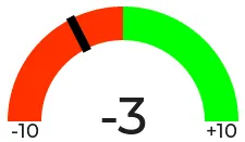
The trick here is to have a parent obj which contains the other widgets as children. We place a
meter in the middle, which is made from an indicator line and two arc widgets. We use
another, smaller obj on top of it to hide the indicator’s central parts and place some
label widgets to display numeric information:
sensor: - platform: ... id: values_between_-10_and_10 on_value: - lvgl.indicator.update: id: val_needle value: !lambda return x; - lvgl.label.update: id: val_text text: format: "%.0f" args: [ 'x' ]lvgl: ... pages: - id: gauge_page widgets: - obj: height: 240 width: 240 align: CENTER bg_color: 0xFFFFFF border_width: 0 pad_all: 4 widgets: - meter: height: 100% width: 100% border_width: 0 bg_opa: TRANSP align: CENTER scales: - range_from: -10 range_to: 10 angle_range: 180 # sets the total angle to 180 = starts mid left and ends mid right ticks: count: 0 indicators: - line: id: val_needle width: 8 r_mod: 12 # sets line length by this much difference from the scale default radius value: -2 - arc: # first half of the scale background color: 0xFF3000 r_mod: 10 # radius difference from the scale default radius width: 31 start_value: -10 end_value: 0 - arc: # second half of the scale background color: 0x00FF00 r_mod: 10 width: 31 start_value: 0 end_value: 10 - obj: # to cover the middle part of meter indicator line height: 146 width: 146 radius: 73 align: CENTER border_width: 0 bg_color: 0xFFFFFF pad_all: 0 - label: # gauge numeric indicator id: val_text text_font: montserrat_48 align: CENTER y: -5 text: "0" - label: # lower range indicator text_font: montserrat_18 align: CENTER y: 8 x: -90 text: "-10" - label: # higher range indicator text_font: montserrat_18 align: CENTER y: 8 x: 90 text: "+10"TIP
The obj used to hide the middle part of the meter indicator line has radius equal to half of the width and
height. This results in a circle - which is actually a square with extra large rounded corners.
Thermometer
Section titled “Thermometer”A thermometer with a precise gauge also made from a meter widget and a numeric display using
label:
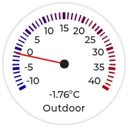
Whenever a new value comes from the sensor, we update the needle indicator as well as the text in the
label. Since LVGL only handles integer values on the meter scale,
but the sensor’s value is a float, we use the same approach as in the examples above; we multiply the sensor’s
values by 10 and feed this value to the meter. It’s essentially two scales on top of each
other: one to set the needle based on the multiplied value and the other to show sensor’s original value in the
label.
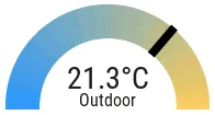
sensor: - platform: ... id: outdoor_temperature on_value: - lvgl.indicator.update: id: temperature_needle value: !lambda return x * 10; - lvgl.label.update: id: temperature_text text: format: "%.1f°C" args: [ 'x' ]lvgl: ... pages: - id: meter_page widgets: - meter: align: CENTER height: 180 width: 180 scales: - range_from: -100 # scale for the needle value range_to: 400 angle_range: 240 rotation: 150 indicators: - line: id: temperature_needle width: 2 color: 0xFF0000 r_mod: -4 - tick_style: start_value: -10 end_value: 40 color_start: 0x0000bd color_end: 0xbd0000 width: 1 - range_from: -10 # scale for the value labels range_to: 40 angle_range: 240 rotation: 150 ticks: width: 1 count: 51 length: 10 color: 0x000000 major: stride: 5 width: 2 length: 10 color: 0x404040 label_gap: 10 widgets: - label: id: temperature_text text: "-.-°C" align: CENTER y: 45 - label: text: "Outdoor" align: CENTER y: 65And here’s the same sensor configuration, but instead with a semicircle gauge with a gradient background drawn by a multitude of ticks:
If you change the size of the widget, to obtain a uniform gradient, be sure to increase or decrease the ticks count accordingly.
lvgl: ... pages: - id: meter_page widgets: - obj: height: 240 width: 240 align: CENTER y: -18 bg_color: 0xFFFFFF border_width: 0 pad_all: 14 widgets: - meter: height: 100% width: 100% border_width: 0 align: CENTER bg_opa: TRANSP scales: - range_from: -15 range_to: 35 angle_range: 180 ticks: count: 70 width: 1 length: 31 indicators: - tick_style: start_value: -15 end_value: 35 color_start: 0x3399ff color_end: 0xffcc66 - range_from: -150 range_to: 350 angle_range: 180 ticks: count: 0 indicators: - line: id: temperature_needle width: 8 r_mod: 2 value: -150 - obj: # to cover the middle part of meter indicator line height: 123 width: 123 radius: 73 align: CENTER border_width: 0 pad_all: 0 bg_color: 0xFFFFFF - label: id: temperature_text text: "--.-°C" align: CENTER y: -26 - label: text: "Outdoor" align: CENTER y: -6TIP
You can omit the obj used to hide the middle part of meter indicator line by using a bitmap image indicator as
needle, were only the part hanging above the ticks scale is visible, the rest is transparent.
Climate control
Section titled “Climate control”spinbox is the ideal widget to control a thermostat:
First we import from Home Assistant the current target temperature of the climate component, and we update the value of the spinbox with it whenever it changes. We use two buttons labeled with minus and plus to control the spinbox, and whenever we change its value, we just simply call a Home Assistant action to set the new target temperature of the climate.
sensor:  - platform: homeassistant    id: room_thermostat    entity_id: climate.room_thermostat    attribute: temperature    on_value:      - lvgl.spinbox.update:          id: spinbox_id          value: !lambda return x;
lvgl:    ...    pages:      - id: thermostat_control        widgets:          - obj:              align: BOTTOM_MID              y: -50              layout:                type: FLEX                flex_flow: ROW                flex_align_cross: CENTER              width: SIZE_CONTENT              height: SIZE_CONTENT              widgets:                - button:                    id: spin_down                    on_click:                      - lvgl.spinbox.decrement: spinbox_id                    widgets:                      - label:                           text: "-"                - spinbox:                    id: spinbox_id                    align: CENTER                    text_align: CENTER                    width: 50                    range_from: 15                    range_to: 35                    selected_digit: 0                    rollover: false                    digits: 3                    decimal_places: 1                    on_value:                      then:                        - homeassistant.action:                            action: climate.set_temperature                            data:                              temperature: !lambda return x;                              entity_id: climate.room_thermostat                - button:                    id: spin_up                    on_click:                      - lvgl.spinbox.increment: spinbox_id                    widgets:                      - label:                          text: "+"
Cover status and control
Section titled “Cover status and control”To make a nice user interface for controlling Home Assistant covers you could use 3 buttons, which also display the state.
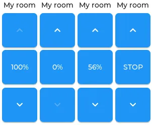
Just as in the previous examples, we need to get the state of the cover first. We’ll use a numeric sensor to retrieve the current position of the cover and a text sensor to retrieve its current movement. We are particularly interested in the moving (opening and closing) states, because during these we’d like to change the label in the middle to show STOP. Otherwise, this button label will show the actual percentage of the opening. Additionally, we’ll change the opacity of the labels on the UP and DOWN buttons depending on if the cover is fully open or closed.
sensor:  - platform: homeassistant    id: cover_myroom_pos    entity_id: cover.myroom    attribute: current_position    on_value:      - if:          condition:            lambda: |-              return x == 100;          then:            - lvgl.widget.update:                id: cov_up_myroom                text_opa: 60%          else:            - lvgl.widget.update:                id: cov_up_myroom                text_opa: 100%      - if:          condition:            lambda: |-              return x == 0;          then:            - lvgl.widget.update:                id: cov_down_myroom                text_opa: 60%          else:            - lvgl.widget.update:                id: cov_down_myroom                text_opa: 100%
text_sensor:  - platform: homeassistant    id: cover_myroom_state    entity_id: cover.myroom    on_value:      - if:          condition:            lambda: |-              return ((0 == x.compare(std::string{"opening"})) or (0 == x.compare(std::string{"closing"})));          then:            - lvgl.label.update:                id: cov_stop_myroom                text: "STOP"          else:            - lvgl.label.update:                id: cov_stop_myroom                text:                  format: "%.0f%%"                  args: [ 'id(cover_myroom_pos).get_state()' ]
lvgl:    ...    pages:      - id: room_page        widgets:          - label:              x: 10              y: 6              width: 70              text: "My room"              text_align: CENTER          - button:              x: 10              y: 30              width: 70              height: 68              widgets:                - label:                    id: cov_up_myroom                    align: CENTER                    text: "\uF077"              on_press:                then:                  - homeassistant.action:                      action: cover.open                      data:                        entity_id: cover.myroom          - button:              x: 10              y: 103              width: 70              height: 68              widgets:                - label:                    id: cov_stop_myroom                    align: CENTER                    text: STOP              on_press:                then:                  - homeassistant.action:                      action: cover.stop                      data:                        entity_id: cover.myroom          - button:              x: 10              y: 178              width: 70              height: 68              widgets:                - label:                    id: cov_down_myroom                    align: CENTER                    text: "\uF078"              on_press:                then:                  - homeassistant.action:                      action: cover.close                      data:                        entity_id: cover.myroom
Theme and style definitions
Section titled “Theme and style definitions”Since LVGL uses inheritance to apply styles across the widgets, it’s possible to apply them at the top level, and only make modifications on demand, if necessary.
In this example we prepare a set of gradient styles in the theme, and make some modifications in a style_definition which can be applied in a batch to the desired widgets. Theme is applied automatically, and can be overridden manually with style definitions (read further to see how).
lvgl: ... theme: label: text_font: my_font # set all your labels to use your custom defined font button: bg_color: 0x2F8CD8 bg_grad_color: 0x005782 bg_grad_dir: VER bg_opa: COVER border_color: 0x0077b3 border_width: 1 text_color: 0xFFFFFF pressed: # set some button colors to be different in pressed state bg_color: 0x006699 bg_grad_color: 0x00334d checked: # set some button colors to be different in checked state bg_color: 0x1d5f96 bg_grad_color: 0x03324A text_color: 0xfff300 buttonmatrix: bg_opa: TRANSP border_color: 0x0077b3 border_width: 0 text_color: 0xFFFFFF pad_all: 0 items: # set all your buttonmatrix buttons to use your custom defined styles and font bg_color: 0x2F8CD8 bg_grad_color: 0x005782 bg_grad_dir: VER bg_opa: COVER border_color: 0x0077b3 border_width: 1 text_color: 0xFFFFFF text_font: my_font pressed: bg_color: 0x006699 bg_grad_color: 0x00334d checked: bg_color: 0x1d5f96 bg_grad_color: 0x03324A text_color: 0x005580 switch: bg_color: 0xC0C0C0 bg_grad_color: 0xb0b0b0 bg_grad_dir: VER bg_opa: COVER checked: bg_color: 0x1d5f96 bg_grad_color: 0x03324A bg_grad_dir: VER bg_opa: COVER knob: bg_color: 0xFFFFFF bg_grad_color: 0xC0C0C0 bg_grad_dir: VER bg_opa: COVER slider: border_width: 1 border_opa: 15% bg_color: 0xcccaca bg_opa: 15% indicator: bg_color: 0x1d5f96 bg_grad_color: 0x03324A bg_grad_dir: VER bg_opa: COVER knob: bg_color: 0x2F8CD8 bg_grad_color: 0x005782 bg_grad_dir: VER bg_opa: COVER border_color: 0x0077b3 border_width: 1 text_color: 0xFFFFFF style_definitions: - id: header_footer bg_color: 0x2F8CD8 bg_grad_color: 0x005782 bg_grad_dir: VER bg_opa: COVER border_opa: TRANSP radius: 0 pad_all: 0 pad_row: 0 pad_column: 0 border_color: 0x0077b3 text_color: 0xFFFFFF width: 100% height: 30Note that style definitions can contain common properties too, like positioning and sizing.
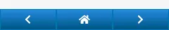
Page navigation footer
Section titled “Page navigation footer”If using multiple pages, a navigation bar can be useful at the bottom of the screen:
To save from repeating the same widgets on each page, there’s the top_layer which is the Always on Top transparent page above all the pages. Everything you put on this page will be on top of all the others.
For the navigation bar we can use a buttonmatrix. Note how the header_footer style
definition is being applied to the widget and its children objects, and how a few more styles are configured manually
at the main widget:
lvgl: ... top_layer: widgets: - buttonmatrix: align: bottom_mid styles: header_footer pad_all: 0 outline_width: 0 id: top_layer items: styles: header_footer rows: - buttons: - id: page_prev text: "\uF053" on_press: then: lvgl.page.previous: - id: page_home text: "\uF015" on_press: then: lvgl.page.show: main_page - id: page_next text: "\uF054" on_press: then: lvgl.page.next:For this example to appear correctly, use the theme and style options from above and LVGL’s own library fonts.
API connection status icon
Section titled “API connection status icon”The top layer is useful to show status icons visible on all pages:
In the example below, we only show the icon when the connection with Home Assistant is established:
api:  on_client_connected:    - if:        condition:          lambda: 'return (0 == client_info.find("Home Assistant "));'        then:          - lvgl.widget.show: lbl_hastatus  on_client_disconnected:    - if:        condition:          lambda: 'return (0 == client_info.find("Home Assistant "));'        then:          - lvgl.widget.hide: lbl_hastatus
lvgl:  ...  top_layer:    widgets:      - label:          text: "\uF1EB"          id: lbl_hastatus          hidden: true          align: top_right          x: -2          y: 7          text_align: right          text_color: 0xFFFFFF
Of note:
- The widget starts hidden at boot and it’s only shown when triggered by connection with the API.
- Alignment of the widget: since the align option is given, the x and y options are used to position the widget
- relative to the calculated position.
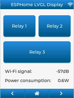
Title bar for each page
Section titled “Title bar for each page”Each page can have its own title bar:
To put a title bar behind the status icon, we need to add it to each page, also containing the label with a unique title:
lvgl: ... pages: - id: main_page widgets: - obj: align: TOP_MID styles: header_footer widgets: - label: text: "ESPHome LVGL Display" align: CENTER text_align: CENTER text_color: 0xFFFFFF ... - id: second_page widgets: - obj: align: TOP_MID styles: header_footer widgets: - label: text: "A second page" align: CENTER text_align: CENTER text_color: 0xFFFFFF ...For this example to work, use the theme and style options from above.
Flex layout positioning
Section titled “Flex layout positioning”Layouts aim to position widgets automatically, eliminating the need to specify coordinates to position each widget. This is a great way to simplify your configuration containing many widgets as it allows you to even omit alignment options.
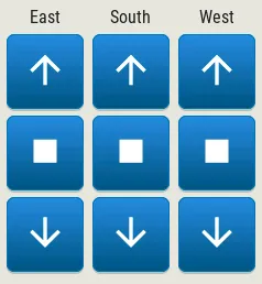
This example illustrates a control panel for three covers, made up of labels and discrete buttons. Although a button matrix could also be suitable for this, you might still prefer fully-featured individual buttons, as they offer a wider range of customization possibilities as seen in the Cover status and control example. Here we use the Flex layout:
lvgl:    ...    pages:      - id: room_page        widgets:          - obj: # a properly placed container object for all these controls              align: CENTER              width: 240              height: 256              x: 4              y: 4              pad_all: 3              bg_opa: TRANSP              border_opa: TRANSP              layout: # enable the FLEX layout for the children widgets                type: FLEX                flex_flow: COLUMN_WRAP # the order of the widgets starts top left                flex_align_cross: CENTER # they sould be centered                pad_row: 6                pad_column: 8              widgets:                - label:                    text: "East"                - button:                    id: but_cov_up_east                    width: 70 # choose the button dimensions so                    height: 68 # they fill the columns nicely as they flow                    widgets:                      - label:                          id: cov_up_east                          align: CENTER                          text: "\U000F005D" # mdi:arrow-up                - button:                    id: but_cov_stop_east                    width: 70                    height: 68                    widgets:                      - label:                          id: cov_stop_east                          align: CENTER                          text: "\U000F04DB" # mdi:stop                - button:                    id: but_cov_down_east                    width: 70                    height: 68                    widgets:                      - label:                          id: cov_down_east                          align: CENTER                          text: "\U000F0045" # mdi:arrow-down
                - label:                    text: "South"                - button:                    id: but_cov_up_south                    width: 70                    height: 68                    widgets:                      - label:                          id: cov_up_south                          align: CENTER                          text: "\U000F005D"                - button:                    id: but_cov_stop_south                    width: 70                    height: 68                    widgets:                      - label:                          id: cov_stop_south                          align: CENTER                          text: "\U000F04DB"                - button:                    id: but_cov_down_south                    width: 70                    height: 68                    widgets:                      - label:                          id: cov_down_south                          align: CENTER                          text: "\U000F0045"
                - label:                    text: "West"                - button:                    id: but_cov_up_west                    width: 70                    height: 68                    widgets:                      - label:                          id: cov_up_west                          align: CENTER                          text: "\U000F005D"                - button:                    id: but_cov_stop_west                    width: 70                    height: 68                    widgets:                      - label:                          id: cov_stop_west                          align: CENTER                          text: "\U000F04DB"                - button:                    id: but_cov_down_west                    width: 70                    height: 68                    widgets:                      - label:                          id: cov_down_west                          align: CENTER                          text: "\U000F0045"
This saved you from a considerable amount of manual calculation of widget positioning which would otherwise be required
to place them manually with x and y ! You only need to determine a common width and height for your widgets to
distribute them on the page as you prefer. (MDI icons in text below shows how to use custom
icons.)
Grid layout positioning
Section titled “Grid layout positioning”But there’s even more! With the Grid layout, you don’t need to specify width and height for your widgets. All you have to do is divide the space into rows and columns; the widgets can be automatically be sized to fit into cells defined by these rows and columns. The same task from above, in a fully automated grid, looks like this:
lvgl:    ...    pages:      - id: room_page        widgets:          - obj: # a properly placed container object for all these controls              align: CENTER              width: 240              height: 256              pad_all: 6              bg_opa: TRANSP              border_opa: TRANSP              layout: # enable the GRID layout for the children widgets                type: GRID # split the rows and the columns proportionally                grid_columns: [FR(1), FR(1), FR(1)] # equal                grid_rows: [FR(10), FR(30), FR(30), FR(30)] # like percents                pad_row: 6                pad_column: 8              widgets:                - label:                    text: "East"                    grid_cell_column_pos: 0 # place the widget in                    grid_cell_row_pos: 0 # the corresponding cell                    grid_cell_x_align: STRETCH                    grid_cell_y_align: STRETCH                - button:                    id: but_cov_up_east                    grid_cell_column_pos: 0                    grid_cell_row_pos: 1                    grid_cell_x_align: STRETCH                    grid_cell_y_align: STRETCH                    widgets:                      - label:                          id: cov_up_east                          align: CENTER                          text: "\U000F005D"                - button:                    id: but_cov_stop_east                    grid_cell_column_pos: 0                    grid_cell_row_pos: 2                    grid_cell_x_align: STRETCH                    grid_cell_y_align: STRETCH                    widgets:                      - label:                          id: cov_stop_east                          align: CENTER                          text: "\U000F04DB"                - button:                    id: but_cov_down_east                    grid_cell_column_pos: 0                    grid_cell_row_pos: 3                    grid_cell_x_align: STRETCH                    grid_cell_y_align: STRETCH                    widgets:                      - label:                          id: cov_down_east                          align: CENTER                          text: "\U000F0045"
                - label:                    text: "South"                    grid_cell_column_pos: 1                    grid_cell_row_pos: 0                    grid_cell_x_align: STRETCH                    grid_cell_y_align: STRETCH                - button:                    id: but_cov_up_south                    grid_cell_column_pos: 1                    grid_cell_row_pos: 1                    grid_cell_x_align: STRETCH                    grid_cell_y_align: STRETCH                    widgets:                      - label:                          id: cov_up_south                          align: CENTER                          text: "\U000F005D"                - button:                    id: but_cov_stop_south                    grid_cell_column_pos: 1                    grid_cell_row_pos: 2                    grid_cell_x_align: STRETCH                    grid_cell_y_align: STRETCH                    widgets:                      - label:                          id: cov_stop_south                          align: CENTER                          text: "\U000F04DB"                - button:                    id: but_cov_down_south                    grid_cell_column_pos: 1                    grid_cell_row_pos: 3                    grid_cell_x_align: STRETCH                    grid_cell_y_align: STRETCH                    widgets:                      - label:                          id: cov_down_south                          align: CENTER                          text: "\U000F0045"
                - label:                    text: "West"                    grid_cell_column_pos: 2                    grid_cell_row_pos: 0                    grid_cell_x_align: STRETCH                    grid_cell_y_align: STRETCH                - button:                    id: but_cov_up_west                    grid_cell_column_pos: 2                    grid_cell_row_pos: 1                    grid_cell_x_align: STRETCH                    grid_cell_y_align: STRETCH                    widgets:                      - label:                          id: cov_up_west                          align: CENTER                          text: "\U000F005D"                - button:                    id: but_cov_stop_west                    grid_cell_column_pos: 2                    grid_cell_row_pos: 2                    grid_cell_x_align: STRETCH                    grid_cell_y_align: STRETCH                    widgets:                      - label:                          id: cov_stop_west                          align: CENTER                          text: "\U000F04DB"                - button:                    id: but_cov_down_west                    grid_cell_column_pos: 2                    grid_cell_row_pos: 3                    grid_cell_x_align: STRETCH                    grid_cell_y_align: STRETCH                    widgets:                      - label:                          id: cov_down_west                          align: CENTER                          text: "\U000F0045"
The big advantage here is that whenever you need to add, for example, an extra column of buttons for a new cover, you
just simply append it to the grid_columns variable, and add the corresponding widgets as above. With STRETCH their
sizes and positions will automatically be calculated to fill in the cells, while the parent’s pad_all, pad_row
and pad_column can help with spacing between them. See Weather forecast panel further down
this page for another example relying on Grid.
ESPHome boot screen
Section titled “ESPHome boot screen”To display a boot image with a spinner animation which disappears automatically after a few moments or on touch of the
screen you can use the top layer. The trick is to put a base obj full screen and child
image widget in its middle as the last item of the widgets list, so they draw on top of all the
others. To make it automatically disappear afer boot, you use ESPHome’s on_boot trigger:
esphome:  ...  on_boot:    - delay: 5s    - lvgl.widget.hide: boot_screen
image:  - file: https://media.esphome.io/logo/logo.png    id: boot_logo    resize: 200x200    type: RGB565    transparency: alpha_channel
lvgl:  ...  top_layer:    widgets:      ... # make sure it's the last one in this list:      - obj:          id: boot_screen          x: 0          y: 0          width: 100%          height: 100%          bg_color: 0xffffff          bg_opa: COVER          radius: 0          pad_all: 0          border_width: 0          widgets:            - image:                align: CENTER                src: boot_logo                y: -40            - spinner:                align: CENTER                y: 95                height: 50                width: 50                spin_time: 1s                arc_length: 60deg                arc_width: 8                indicator:                  arc_color: 0x18bcf2                  arc_width: 8          on_press:            - lvgl.widget.hide: boot_screen
MDI icons in text
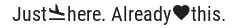
Section titled “MDI icons in text”ESPHome’s font renderer allows you to use any OpenType/TrueType font file for your text. This is very flexible because you can prepare various sets of fonts at different sizes each with a different number of glyphs; this is important as it may help to conserve flash memory space.
One example is when you’d like some MDI icons to be used in line with the text (similar to how LVGL’s internal fonts and symbols coexist). You can use a font of your choice; choose the symbols/icons from MDI you want and mix them in a single sized set.
In the example below, we use the default set of glyphs from RobotoCondensed-Regular and append some extra symbols to it from MDI. Then we display these inline with the text by escaping their codepoints:
font:  - file: "fonts/RobotoCondensed-Regular.ttf"    id: roboto_icons_42    size: 42    bpp: 4    extras:      - file: "fonts/materialdesignicons-webfont.ttf"        glyphs: [          "\U000F02D1", # mdi-heart          "\U000F05D4", # mdi-airplane-landing          ]
lvgl:    ...    pages:      - id: main_page        widgets:          - label:              text: "Just\U000f05d4here. Already\U000F02D1this."              align: CENTER              text_align: CENTER              text_font: roboto_icons_42
TIP
Follow these steps to choose your MDI icons:
- To lookup your icons, use the Pictogrammers site. Click on the desired
- icon and note its codepoint (it’s the hexadecimal number near the download options).
- To get the TrueType font with all the icons in it, head on to the
- Pictogrammers GitHub repository
-and from a recent version folder, download the materialdesignicons-webfont.ttf file and place it in your ESPHome
config directory under a folder named fonts (to match the example above).
- To use the desired icon, prepend the copied codepoint with
\U000. The Unicode character escape sequence has to - start with capital
\Uand have exactly 8 hexadecimal digits. - To translate the escape sequence into the real glyph, make sure you enclose your strings in double quotes.
Restore checkbox mark
Section titled “Restore checkbox mark”If you configure a custom font as the default_font used by LVGL and this font does not contain the
FontAwesome symbols, you may observe that some widgets won’t display correctly; specifically
checkbox won’t show the checkmark when it’s checked.
To work around this issue, simply import only the checkmark symbol in the desired size and apply it through Theme and style definitions to all the checkboxes in the configuration:
font:  - file: 'fonts/FontAwesome5-Solid+Brands+Regular.woff'    id: fontawesome_checkmark    size: 18    bpp: 4    glyphs: [      "\uF00C", # ckeckmark, for checkbox      ]
lvgl:    ...    theme:      checkbox:        indicator:          checked:            text_font: fontawesome_checkmark
You could of course simply apply one of the built-in montserrat_ packs, but that would not be beneficial on the
binary size - it would uselessly include the entire set of glyphs in the flash.
Toggle state icon button
Section titled “Toggle state icon button”
A common use case for icons is a status display. For example, a checkable (toggle) button will display different
icons based on the status of a light or switch. To put an icon on a button you use a label
widget as the child of the button. The coloring can already be different thanks to the
Theme and style definitions where you can set a different color for the checked state.
Additionally, by using a text_sensor to import the state from Home Assistant, we can not only track the on state,
but also the unavailable or unknown states to apply disabled styles for these cases.
If we take our previous Remote light button example, we can modify it like this:
font:  - file: "custom/materialdesignicons-webfont.ttf"    id: mdi_42    size: 42    bpp: 4    glyphs: [      "\U000F0335", # mdi-lightbulb      "\U000F0336", # mdi-lightbulb-outline      ]
text_sensor:  - platform: homeassistant    id: ts_remote_light    entity_id: light.remote_light    on_value:      then:        - lvgl.widget.update:            id: btn_lightbulb            state:              checked: !lambda return (0 == x.compare(std::string{"on"}));              disabled: !lambda return ((0 == x.compare(std::string{"unavailable"})) or (0 == x.compare(std::string{"unknown"})));        - lvgl.label.update:            id: lbl_lightbulb            text: !lambda |-              static char buf[10];              std::string icon;              if (0 == x.compare(std::string{"on"})) {                  icon = "\U000F0335";              } else {                  icon = "\U000F0336";              }              snprintf(buf, sizeof(buf), "%s", icon.c_str());              return buf;
lvgl:    ...    pages:      - id: room_page        widgets:          - button:              x: 110              y: 40              width: 90              height: 50              checkable: true              id: btn_lightbulb              widgets:                - label:                    id: lbl_lightbulb                    align: CENTER                    text_font: mdi_42                    text: "\U000F0336" # mdi-lightbulb-outline              on_short_click:                - homeassistant.action:                    action: light.toggle                    data:                      entity_id: light.remote_light
Battery status icon
Section titled “Battery status icon”
Another example for using MDI icons is to display battery percentage in 10 steps. We need to have a font containing the glyphs corresponding to the different battery percentage levels, and we need a sensor to import the battery status from Home Assistant into a numeric value. We use a lambda to return the codepoint of the corresponding glyph based on the sensor value:
font:  - file: "fonts/materialdesignicons-webfont.ttf"    id: battery_icons_20    size: 20    bpp: 4    glyphs: [      "\U000F007A", # mdi-battery-10      "\U000F007B", # mdi-battery-20      "\U000F007C", # mdi-battery-30      "\U000F007D", # mdi-battery-40      "\U000F007E", # mdi-battery-50      "\U000F007F", # mdi-battery-60      "\U000F0080", # mdi-battery-70      "\U000F0081", # mdi-battery-80      "\U000F0082", # mdi-battery-90      "\U000F0079", # mdi-battery (full)      "\U000F008E", # mdi-battery-outline      "\U000F0091", # mdi-battery-unknown      ]
sensor:  - platform: homeassistant    id: sns_battery_percentage    entity_id: sensor.device_battery    on_value:      - lvgl.label.update:          id: lbl_battery_status          text: !lambda |-            static char buf[10];            std::string icon;            if (x == 100.0) {                icon = "\U000F0079"; // mdi-battery (full)            } else if (x > 90) {                icon = "\U000F0082"; // mdi-battery-90            } else if (x > 80) {                icon = "\U000F0081"; // mdi-battery-80            } else if (x > 70) {                icon = "\U000F0080"; // mdi-battery-70            } else if (x > 60) {                icon = "\U000F007F"; // mdi-battery-60            } else if (x > 50) {                icon = "\U000F007E"; // mdi-battery-50            } else if (x > 40) {                icon = "\U000F007D"; // mdi-battery-40            } else if (x > 30) {                icon = "\U000F007C"; // mdi-battery-30            } else if (x > 20) {                icon = "\U000F007B"; // mdi-battery-20            } else if (x > 10) {                icon = "\U000F007A"; // mdi-battery-10            } else if (x > 0) {                icon = "\U000F008E"; // mdi-battery-outline            } else {                icon = "\U000F0091"; // mdi-battery-unknown            }            snprintf(buf, sizeof(buf), "%s", icon.c_str());            return buf;
lvgl:    ...    pages:      - id: battery_page        widgets:          - label:              id: lbl_battery_status              align: TOP_RIGHT              y: 40              x: -10              text_font: battery_icons_20              text: "\U000F0091" # start with mdi-battery-unknown
Battery charging animation
Section titled “Battery charging animation”
To have an animation illustrating a battery charging, you can use animimg with a set of
images rendered from MDI showing battery levels:
image:  - file: mdi:battery-10    id: batt_10    resize: 20x20  - file: mdi:battery-20    id: batt_20    resize: 20x20  - file: mdi:battery-30    id: batt_30    resize: 20x20  - file: mdi:battery-40    id: batt_40    resize: 20x20  - file: mdi:battery-50    id: batt_50    resize: 20x20  - file: mdi:battery-60    id: batt_60    resize: 20x20  - file: mdi:battery-70    id: batt_70    resize: 20x20  - file: mdi:battery-80    id: batt_80    resize: 20x20  - file: mdi:battery-90    id: batt_90    resize: 20x20  - file: mdi:battery    id: batt_full    resize: 20x20  - file: mdi:battery-outline    id: batt_empty    resize: 20x20
lvgl:    ...    pages:      - id: battery_page        widgets:          - animimg:              align: TOP_RIGHT              y: 41              x: -10              id: ani_battery_charging              src: [                batt_empty,                batt_10,                batt_20,                batt_30,                batt_40,                batt_50,                batt_60,                batt_70,                batt_80,                batt_90,                batt_full                ]              duration: 2200ms
TIP
You can use both battery examples above placed on top of each other, and switch their hidden flag depending if the
charger is connected or not:
binary_sensor: - platform: ... id: charger_connected on_press: then: - lvgl.widget.show: ani_battery_charging - lvgl.widget.hide: lbl_battery_status on_release: then: - lvgl.widget.show: lbl_battery_status - lvgl.widget.hide: ani_battery_chargingUse x, y, align widget properties for precise positioning.
An analog clock
Section titled “An analog clock”Using the meter and label widgets, we can create an analog clock which
shows the date too.
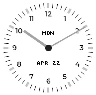
The meter has three scales: one for minutes ticks and hand, ranged between 0 and 60; one
for the hour ticks and the labels as majors, ranged between 1 and 12; and a higher resolution scale for the hour
hand, ranged between 0 and 720, to be able to naturally position the hand in between the hours. The second scale
doesn’t have an indicator, while the third scale doesn’t have ticks nor labels.
The script runs at the beginning of every minute to update the line positions for each hand as well as the respective text.
lvgl:  ...  pages:    - id: clock_page      widgets:        - obj: # clock container            height: SIZE_CONTENT            width: 240            align: CENTER            pad_all: 0            border_width: 0            bg_color: 0xFFFFFF            widgets:              - meter: # clock face                  height: 220                  width: 220                  align: CENTER                  bg_opa: TRANSP                  border_width: 0                  text_color: 0x000000                  scales:                    - range_from: 0 # minutes scale                      range_to: 60                      angle_range: 360                      rotation: 270                      ticks:                        width: 1                        count: 61                        length: 10                        color: 0x000000                      indicators:                        - line:                            id: minute_hand                            width: 3                            color: 0xa6a6a6                            r_mod: -4                            value: 0                    - range_from: 1 # hours scale for labels                      range_to: 12                      angle_range: 330                      rotation: 300                      ticks:                        width: 1                        count: 12                        length: 1                        major:                          stride: 1                          width: 4                          length: 10                          color: 0xC0C0C0                          label_gap: 12                    - range_from: 0 # hi-res hours scale for hand                      range_to: 720                      angle_range: 360                      rotation: 270                      ticks:                        count: 0                      indicators:                        - line:                            id: hour_hand                            width: 5                            color: 0xa6a6a6                            r_mod: -30                            value: 0              - label:                  styles: date_style                  id: day_label                  y: -30              - label:                  id: date_label                  styles: date_style                  y: 30
time:  - platform: homeassistant    id: time_comp    on_time_sync:      - script.execute: time_update    on_time:      - minutes: '*'        seconds: 0        then:          - script.execute: time_update
script:  - id: time_update    then:      - lvgl.indicator.update:          id: minute_hand          value: !lambda |-            return id(time_comp).now().minute;      - lvgl.indicator.update:          id: hour_hand          value: !lambda |-            auto now = id(time_comp).now();            return std::fmod(now.hour, 12) * 60 + now.minute;      - lvgl.label.update:          id: date_label          text: !lambda |-            static const char * const mon_names[] = {"JAN", "FEB", "MAR", "APR", "MAY", "JUN",                                                     "JUL", "AUG", "SEP", "OCT", "NOV", "DEC"};            static char date_buf[8];            auto now = id(time_comp).now();            snprintf(date_buf, sizeof(date_buf), "%s %2d", mon_names[now.month-1], now.day_of_month);            return date_buf;      - lvgl.label.update:          id: day_label          text: !lambda |-            static const char * const day_names[] = {"SUN", "MON", "TUE", "WED", "THU", "FRI", "SAT"};            return day_names[id(time_comp).now().day_of_week - 1];
A numeric input keypad
Section titled “A numeric input keypad”The buttonmatrix widget can work together with the
Key collector component to collect the button presses as key press sequences. It sends the text of
the buttons (or key_code where configured) to the key collector.
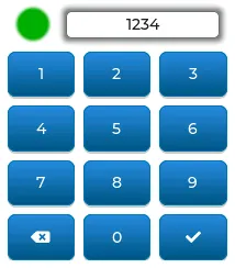
If you key in the correct sequence, the led widget will change color accordingly:
lvgl:  ...  pages:    - id: keypad_page      widgets:        - led:            id: lvgl_led            x: 30            y: 47            color: 0xFF0000            brightness: 70%        - obj:            width: 140            height: 25            align_to:              id: lvgl_led              align: OUT_RIGHT_MID              x: 17            border_width: 1            border_color: 0            border_opa: 50%            pad_all: 0            bg_opa: 80%            bg_color: 0xFFFFFF            shadow_color: 0            shadow_opa: 50%            shadow_width: 10            shadow_spread: 3            radius: 5            widgets:              - label:                  id: lvgl_label                  align: CENTER                  text: "Enter code and \uF00C"                  text_align: CENTER        - buttonmatrix:            id: lvgl_keypad            x: 20            y: 85            width: 200            height: 190            items:              pressed:                bg_color: 0xFFFF00            rows:              - buttons:                  - text: 1                    control:                      no_repeat: true                  - text: 2                    control:                      no_repeat: true                  - text: 3                    control:                      no_repeat: true              - buttons:                  - text: 4                    control:                      no_repeat: true                  - text: 5                    control:                      no_repeat: true                  - text: 6                    control:                      no_repeat: true              - buttons:                  - text: 7                    control:                      no_repeat: true                  - text: 8                    control:                      no_repeat: true                  - text: 9                    control:                      no_repeat: true              - buttons:                  - text: "\uF55A"                    key_code: "*"                    control:                      no_repeat: true                  - text: 0                    control:                      no_repeat: true                  - text: "\uF00C"                    key_code: "#"                    control:                      no_repeat: true
key_collector:  - source_id: lvgl_keypad    min_length: 4    max_length: 4    end_keys: "#"    end_key_required: true    back_keys: "*"    allowed_keys: "0123456789*#"    timeout: 5s    on_progress:      - if:          condition:            lambda: return (0 != x.compare(std::string{""}));          then:            - lvgl.label.update:                id: lvgl_label                text: !lambda 'return x.c_str();'          else:            - lvgl.label.update:                id: lvgl_label                text: "Enter code and \uF00C"    on_result:      - if:          condition:            lambda: return (0 == x.compare(std::string{"1234"}));          then:            - lvgl.led.update:                id: lvgl_led                color: 0x00FF00          else:            - lvgl.led.update:                id: lvgl_led                color: 0xFF0000
Of note:
- A base object
objis used as a parent for the label; this allows proper centering of the label as well as - emphasizing it with shadows independently of the label’s dimensions.
align_tois used to align the label to theledvertically.- Changing the background color of the buttons in
pressedstate. - Use of the
key_codeconfiguration to send a different character tokey_collectorinstead of the displayed symbol.
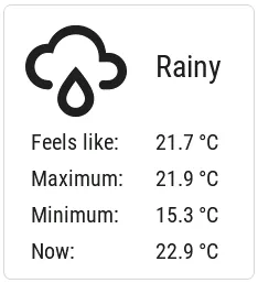
Weather forecast panel
Section titled “Weather forecast panel”Another example relying on the Grid layout can be a weather panel showing the forecast through the OpenWeatherMap integration of Home Assistant.
All the information displayed here could be retrieved to local platform: homeassistant sensors as desribed in several
examples in this Cookbook, however, this time we take a different approach. Instead of pulling the data by ESPHome,
we’ll be pushing it from Home Assistant, to native Lvgl components.
The weather condition icons we use are from MDI. We import just the ones corresponding to the weather conditions supported by the Weather integration in Home Assistant. For all the other labels you can use any font of your choice.
binary_sensor:  - platform: status    name: Status sensor
font:  - file: "fonts/materialdesignicons-webfont.ttf"    id: icons_100    size: 100    bpp: 4    glyphs: [      "\U000F0594", # clear-night      "\U000F0590", # cloudy      "\U000F0F2F", # exceptional      "\U000F0591", # fog      "\U000F0592", # hail      "\U000F0593", # lightning      "\U000F067E", # lightning-rainy      "\U000F0595", # partlycloudy      "\U000F0596", # pouring      "\U000F0597", # rainy      "\U000F0598", # snowy      "\U000F067F", # snowy-rainy      "\U000F0599", # sunny      "\U000F059D", # windy      "\U000F059E", # windy-variant      "\U000F14E4", # sunny-off      ]
lvgl:  ...  pages:    - id: weather_forecast      widgets:        - obj:            align: CENTER            width: 228            height: 250            pad_all: 10            layout:              pad_column: 0              type: GRID              grid_rows: [FR(48), FR(13), FR(13), FR(13), FR(13)]              grid_columns: [FR(10), FR(40), FR(40), FR(10)]            widgets:              - label:                  text: "\U000F14E4"                  id: lbl_weather_forecast_condition_icon                  text_font: icons_100                  text_align: CENTER                  grid_cell_row_pos: 0                  grid_cell_column_pos: 0                  grid_cell_column_span: 2                  grid_cell_x_align: CENTER                  grid_cell_y_align: START
              - label:                  text: "Unknown"                  id: lbl_weather_forecast_condition_name                  text_align: CENTER                  grid_cell_row_pos: 0                  grid_cell_column_pos: 2                  grid_cell_column_span: 2                  grid_cell_x_align: STRETCH                  grid_cell_y_align: CENTER
              - label:                  text: "Feels like:"                  grid_cell_row_pos: 1                  grid_cell_column_pos: 1
              - label:                  text: "--.- °C"                  id: lbl_weather_forecast_tempap                  text_align: RIGHT                  grid_cell_row_pos: 1                  grid_cell_column_pos: 2                  grid_cell_x_align: STRETCH
              - label:                  text: "Maximum:"                  grid_cell_row_pos: 2                  grid_cell_column_pos: 1
              - label:                  text: "--.- °C"                  id: lbl_weather_forecast_temphi                  text_align: RIGHT                  grid_cell_row_pos: 2                  grid_cell_column_pos: 2                  grid_cell_x_align: STRETCH
              - label:                  text: "Minimum:"                  grid_cell_row_pos: 3                  grid_cell_column_pos: 1
              - label:                  text: "--.- °C"                  id: lbl_weather_forecast_templo                  text_align: RIGHT                  grid_cell_row_pos: 3                  grid_cell_column_pos: 2                  grid_cell_x_align: STRETCH
              - label:                  text: "Now:"                  grid_cell_row_pos: 4                  grid_cell_column_pos: 1
              - label:                  text: "--.- °C"                  id: lbl_weather_outdnoor_now                  text_align: RIGHT                  grid_cell_row_pos: 4                  grid_cell_column_pos: 2                  grid_cell_x_align: STRETCH
text:  - platform: lvgl    name: fr_cond_icon    widget: lbl_weather_forecast_condition_icon    mode: text  - platform: lvgl    name: fr_cond_name    widget: lbl_weather_forecast_condition_name    mode: text  - platform: lvgl    name: fr_tempap    widget: lbl_weather_forecast_tempap    mode: text  - platform: lvgl    name: fr_temphi    widget: lbl_weather_forecast_temphi    mode: text  - platform: lvgl    name: fr_templo    widget: lbl_weather_forecast_templo    mode: text  - platform: lvgl    name: wd_out_now    widget: lbl_weather_outdnoor_now    mode: text
If you look carefully at the grid_columns variable, you’ll notice that there are two thinner columns at left and right
(FR(10) ). Reason is to add some space to the labels from the edges. And that’s why we had to use
grid_cell_column_span for the widgets in the first row, to take up the space of multiple columns.
These labels will appear in Home Assistant as
editable text components, which makes it very easy to update them
with the text.set_value action. For this purpose, we add the following
automations to Home Assistant:
- id: weather_cond_forecast  alias: 'Weather Forecast Condition'  trigger:    - platform: state      entity_id: sensor.openweathermap_forecast_condition    - platform: state      entity_id: binary_sensor.your_esphome_node_status_sensor      to: 'on'  action:    - action: text.set_value      target:        entity_id:          - text.your_esphome_node_fr_cond_icon      data:        value: >          {% set d = {          "clear-night": "\U000F0594",          "cloudy": "\U000F0590",          "exceptional": "\U000F0F2F",          "fog": "\U000F0591",          "hail": "\U000F0592",          "lightning": "\U000F0593",          "lightning-rainy": "\U000F067E",          "partlycloudy": "\U000F0595",          "pouring": "\U000F0596",          "rainy": "\U000F0597",          "snowy": "\U000F0598",          "snowy-rainy": "\U000F067F",          "sunny": "\U000F0599",          "windy": "\U000F059D",          "windy-variant": "\U000F059E",          "unknown": "\U000F14E4",          "unavailable": "\U000F14E4",          } %}          {{ d.get( states('sensor.openweathermap_forecast_condition') ) }}
    - action: text.set_value      target:        entity_id:          - text.your_esphome_node_fr_cond_name      data:        value: >          {% set d = {          "clear-night": "Clear Night",          "cloudy": "Cloudy",          "exceptional": "Except ional",          "fog": "Fog",          "hail": "Hail",          "lightning": "Lightning",          "lightning-rainy": "Lightning rainy",          "partlycloudy": "Partly cloudy",          "pouring": "Pouring",          "rainy": "Rainy",          "snowy": "Snowy",          "snowy-rainy": "Snowy rainy",          "sunny": "Sunny",          "windy": "Windy",          "windy-variant": "Windy cloudy",          "unknown": "Unknown",          "unavailable": "Unavai lable",          } %}          {{ d.get( states('sensor.openweathermap_forecast_condition') ) }}
- id: weather_temp_feels_like_forecast  alias: 'Weather Temperature Feels Like'  trigger:    - platform: state      entity_id: sensor.openweathermap_feels_like_temperature    - platform: state      entity_id: binary_sensor.your_esphome_node_status_sensor      to: 'on'  action:    - action: text.set_value      target:        entity_id:          - text.your_esphome_node_fr_tempap      data:        value: "{{states('sensor.openweathermap_feels_like_temperature') | round(1)}} °C"
- id: weather_temp_forecast_temphi  alias: 'Weather Temperature Forecast Hi'  trigger:    - platform: state      entity_id: sensor.openweathermap_forecast_temperature    - platform: state      entity_id: binary_sensor.your_esphome_node_status_sensor      to: 'on'  action:    - action: text.set_value      target:        entity_id:          - text.your_esphome_node_fr_temphi      data:        value: "{{states('sensor.openweathermap_forecast_temperature') | round(1)}} °C"
- id: weather_temp_forecast_templo  alias: 'Weather Temperature Forecast Lo'  trigger:    - platform: state      entity_id: sensor.openweathermap_forecast_temperature_low    - platform: state      entity_id: binary_sensor.your_esphome_node_status_sensor      to: 'on'  action:    - action: text.set_value      target:        entity_id:          - text.your_esphome_node_fr_templo      data:        value: "{{states('sensor.openweathermap_forecast_temperature_low') | round(1)}} °C"
- id: weather_temp_outdoor_now  alias: 'Weather Temperature Now'  trigger:    - platform: state      entity_id: sensor.outdoor_temperature    - platform: state      entity_id: binary_sensor.your_esphome_node_status_sensor      to: 'on'  action:    - action: text.set_value      target:        entity_id:          - text.your_esphome_node_wd_out_now      data:        value: "{{states('sensor.outdoor_temperature') | round(1)}} °C"
The automations will be triggered to update the labels every time the corresponding entities change, and when the ESPHome comes alive - the reason you also need the Status. Note that you’ll need to adjust the entity IDs corresponding to your ESPHome node depedning on how you configured it to use its name.
Turn off screen when idle
Section titled “Turn off screen when idle”LVGL has a notion of screen inactivity — in other words, the time since the last user interaction with the screen is
tracked. This can be used to dim the display backlight or turn it off after a moment of inactivity
(like a screen saver). Every use of an input device (touchscreen, rotary encoder) counts as an activity and resets
the inactivity counter. Note that it’s important to use the on_release trigger to accomplish this task. With a
template number you can make the timeout adjustable by the users.
lvgl:  ...  on_idle:    timeout: !lambda "return (id(display_timeout).state * 1000);"    then:      - logger.log: "LVGL is idle"      - light.turn_off: display_backlight      - lvgl.pause:
touchscreen:  - platform: ...    on_release:      - if:          condition: lvgl.is_paused          then:            - logger.log: "LVGL resuming"            - lvgl.resume:            - lvgl.widget.redraw:            - light.turn_on: display_backlight
light:  - platform: ...    id: display_backlight
number:  - platform: template    name: LVGL Screen timeout    optimistic: true    id: display_timeout    unit_of_measurement: "s"    initial_value: 45    restore_value: true    min_value: 10    max_value: 180    step: 5    mode: box
Prevent burn-in of LCD
Section titled “Prevent burn-in of LCD”You can use this to protect and prolong the lifetime of the LCD screens, thus being more green and generating less hazardous waste.
A common problem with wall-mounted LCD screens is that they display the same picture 99.999% of the time. Even if somebody turns off the backlight during the night or dark periods, the LCD screen keeps showing the same picture, but seen by nobody. This scenario is likely to lead to burn-in after a few years of operation.
One way to mitigate this is to exercise the pixels periodically by displaying different content. show_snow option
during LVGL paused state was developed with this in mind; it displays randomly colored pixels across the entire screen
in order to minimize screen burn-in by exercising each individual pixel.
In the example below, pixel training is done four times for a half an hour every night; it can be stopped by touching the screen.
time:  - platform: ...    on_time:      - hours: 2,3,4,5        minutes: 5        seconds: 0        then:          - switch.turn_on: switch_antiburn      - hours: 2,3,4,5        minutes: 35        seconds: 0        then:          - switch.turn_off: switch_antiburn
switch:  - platform: template    name: Antiburn    id: switch_antiburn    icon: mdi:television-shimmer    optimistic: true    entity_category: "config"    turn_on_action:      - logger.log: "Starting Antiburn"      - if:          condition: lvgl.is_paused          then:            - lvgl.resume:            - lvgl.widget.redraw:      - lvgl.pause:          show_snow: true    turn_off_action:      - logger.log: "Stopping Antiburn"      - if:          condition: lvgl.is_paused          then:            - lvgl.resume:            - lvgl.widget.redraw:
touchscreen:  - platform: ...    on_release:      then:        - if:            condition: lvgl.is_paused            then:              - lvgl.resume:              - lvgl.widget.redraw:
You can combine it with the previous example to turn off the backlight, so the users don’t actually notice this.